PATCAM 2010
Welcome To Cut Copy Paste, a step by step guide to totally customize Blogs. Whether you're wanting to build a website or just a really cool blog, I can show you some easy ways to get started.
Feel free to leave suggestions or comments to help make this site better in the Shout Box below.
 Adding Playlist Lesson:
Created By:
PATCAM
Web Designs
Oklahoma City, Ok.
Serving the State of Oklahoma and beyond.
P.W.D. is dedicated to helping small businesses get their products & services on the Internet. We can custom build a website that caters to your needs
and the needs of your customers.
We understand the complexities of Internet Coding and work out all the red tape, so that when you or your customers are ready, you can enjoy all the benefits
of having your very own Website.
We Build:
Websites
Order Forms
Employee Applications
Photo Galleries
Video Productions


PATCAM
Recommends:

Opera Web Browser
|
Lesson 18: Tables
Tables are the "infrastructure" of any webpage. Tables allow you to create rows of information that can be compiled in a way that utilize the most amount of space for each item. To get an idea of what the Table "tags" look like click below: Draac's Table CourseOnce you get the basic idea of which tags do what, you may opt to let Draac just make the code for you. He allows you to enter specific attributes to make each table the way you want it. Click Here For the Table Maker 2Tables are a little more advanced than "basic" html, so as always I recommend that you preview as many times as you can and especially before you save.
Lesson 17: Non Tiling Background
I ran across this website that had a background made out of a picture of the mountains (how serene), anyways the picture was too small and it tiled which made it not look right. There is a code for this problem, if you happen to run into it. There's even a different solution that doesn't even require a code. One thing is just have a picture that is WAY oversized, I'm talkin 1200X960, focus more on the upper left part of whatever photo it is as being the main part of the background that you will see on your screen. Some people try to say that they don't care what other people see or whatever, but if you are a blogger, usually your goal is to have other people come by your site. That's why it's a good idea to try to "cater" to everyones settings. If you do have a photo that is too small, there is a way to make it the center part of your page: Click here to go to that code
Lesson 16: No Underline Links
Want a more uniform look without all the links being underlined? There is an easy code that installs right into the "head" tag of your Template. Click Here to get the code
Lesson 15: Funky Special Letters
There is an obsession over these funky letters in the website community where I build and searches for: 'funky letters for myspace.' Some people have spent countless hours putting these letters together to make pages worth of information written in purely funky letters. ▓▓▓▓▓▓▓▓. ⊙⊙ ☠
◄◄ REW ► PLAY ▌▌PAUSE █▌STOP ►► FF █████ ◄╞, ş ą ğ ♪ ♥ ☺ ღ ๑ ♠ ۩ ▶Music♩♪♫♬ Volume: ▁ ▂ ▃ ▄ ▅ ❒ Taken ❒ Single ✔ TO DO: ☑ A bit of tweeting, ☑ Lay around, ☑ Drink beer, ☑ Be Awesome.
There's so many, look..... €
ƒ
…
†
‡
Œ
•
—
™
š
œ
Ÿ
¡
¢
£
¤
¥
¦
§
¨
©
ª
«
¬
®
¯
°
±
²
³
´
µ
¶
·
¹
º
»
¼
½
¾
¿
À
Á
Â
Ã
Ä
Å
Æ
Ç
È
É
Ê
Ë
Ì
Í
Î
Ï
Ð
Ñ
Ò
Ó
Ô
Õ
Ö
×
Ø
Ù
Ú
Û
Ü
Ý
Þ
ß
à
á
â
ã
ä
å
æ
ç
è
é
ê
ë
ì
í
î
ï
ð
ñ
ò
ó
ô
õ
ö
÷
ø
ù
ú
û
ü
ý
þ
ÿ To use any of these letters, simply drag a box over the text, right click and copy the letter. Then go to where you want to use the letter, right click and paste. Ctrl X - "Cut" remove the selected item but save to clipboard.
Ctrl C - "Copy" the selected area to the clipboard, without removing.
Ctrl V - "Paste" the item you saved to the clipboard to the area you are editing.
Note: each time you Copy or Paste something new, it automatically replaces the other data you had on the clipboard. See How do I cut, copy and paste? for more on this subject.
Lesson 14: Ah, The Marquee
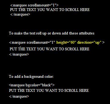
I would NOT go overboard with this code, as too many marquees on one page will cause the page to load slower. Code Example:

Feel free to mix and alter attributes, as long as you put a space between each attribute. Comments are always welcome...
Lesson 13: Opens a link in a new window
I thought this needed to be a lesson all it's own. Blogging leads to needing links to show examples of whatever it is you may be blogging about. When a blogger clicks a link on your page, it's easier for them to see it in a new window, where they can roam around the other site for a second and then when they are done they close the window to reveal your page once again. This is especially useful for Blog Explosion Users. The only difference in a regular link and a link that opens in a new window, is a very simple attribute. Here's an example:  The yellow text is the only thing different from a normal link.
Lesson 12: Border Attribute
Ok, so I have shown you how to put the pictures on your webpage, but there are two more things you should know about placing your images. First is that when you create an image on your page, there is automatically a highlight box (border) put around it. Two, is that you can remove or even increase the size of this border as you see fit. To get rid of the border altogether make the code look like this:  I find this code useful if I am going to use a little image as a clickable link on my page. To make the border larger, just add a number like border="1", and so on. If you have any questions leave them in the comment area.
Independence Day Is Almost Here!
Template Anatomy 101: Section 2
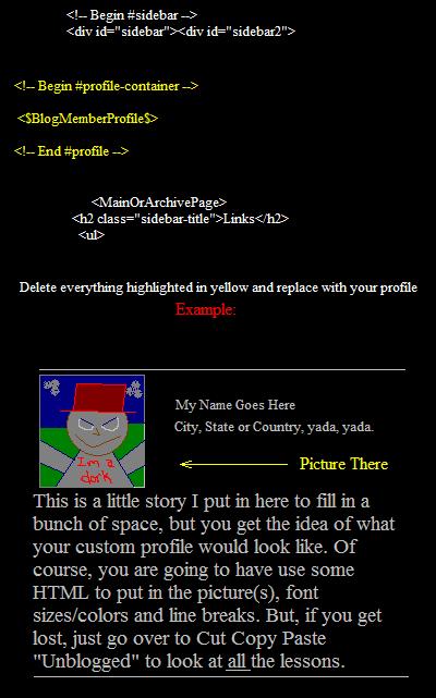
Remember, Template Anatomy 101 is about the "Minima" style template on blogger.com, though these tips are probably universal. Change The Profile AreaIf you don't like the profile tid-bit that blogger has put in your sidebar, you should consider writing one of your own, like this page. You can paste in a picture as big or as small as you like and tell as much or as little information about yourself. Here is what you can do to customize your profile area... In your template scroll through your script until you find these tags:  BE SURE to preview often, and of course before you save changes. As always feel free to comment.
CCP - Networked Blogs on Facebook
|
|


